|
Luo Songsong
songsongluo@126.com
VETERAN Swiss designer Bruno Monguzzi appeared more energetic than his age of 73 years and showed excitement in front of his Asian admirers when he delivered a speech to retrospect his extraordinary career at the OCT Art & Design Gallery where he is holding his first exhibition of original works created from 1961 to 2011 in Asia.
During the event, Monguzzi rose up from his seat all of a sudden and vigorously prickled holes in a blank piece of paper with a pen, only to then elaborate on his creation of a poster created for a jazz concert.
In most cases, Monguzzi devotes himself to indigenously blending typography and photography with great devotion. A typographer of the most exacting precision, he has developed a visual language untouched by the passing whims of fashion.
One of today’s greatest graphic designers, Monguzzi is known as a thoughtful and thought-provoking designer and educator. His professional works, as well as his teaching, have always endeavored to enrich and better the human experience through visual expression in graphic design.
It was in the 1960s that he began to study the typography of the avant-garde movements in London and that his eyes began to grasp the meanings beyond what one merely sees. It was also then that the thick skin of an allegedly brilliant student began to peel off in a slow, long process, and is still in progress today.
“It is there that I stopped worrying about objectivity versus subjectivity and began to focus on appropriateness and relevance. For me, objective typography and functional typography were not necessarily synonymous anymore,” he said.
After working with Dennis Bailey in London, Monguzzi moved to Milan in 1961 to join the Studio Boggeri — at the time the leading design and advertising agency in Italy. In 1965, he joined the Charles Gagnon and James Volkus office in Montreal to design nine pavilions for Expo ’67. From the early 1970s, he worked from his workshop in Meride, a secluded village in southern Switzerland, and has consistently created modern and timeless works that are as visually rich as they are diverse in design, content, and ultimate meaning.
In 1987, he began his 17-year cooperation with Museo Cantonale d’Arte in Lugano, Switzerland, creating a stunning series of posters and a strikingly simple logo for the institution.
The three basic figures of the logo are the circle, the triangle and the square. The triangle is a large capital “A” sheltering a small lower case “M.” A nature drawing by Theo van Doesburg, a renowned Dutch artist, inspired the design. The circle is an eye-catcher.
“The logo symbolizes the complexity of the artistic evolution from the 19th century to the advent of the contemporary art, a historical period in permanent collection at the museum,” Monguzzi said.
Monguzzi’s work has been admired and described as street communication because it is impressive, informative, elegant, and magnetic. Always a great light on any city thoroughfare, it takes hold of the eyes with an initial onslaught of beauty; and then he hands you the gift of intellectual communication.
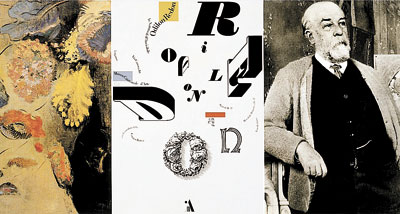
His poster entitled “Les Noces” for an exhibition in the Museo is an emblematic example of how he realizes visual form as a true form of expression — enlivening, enriching, and enlightening. It is clear from this work that he has a passion for form, craft, and function as well as for history.
In the poster, he uses 36 letterforms as design elements — 22 letters from Herbert Bayer’s alphabet, which are mostly from his Bauhaus Universal type variations from 1925; one letter from Theo van Doesburg’s work; four letters of his own assemblage; and three are taken from Oskar Schlemmer’s work.
All of these letterforms are in one way or another historically and thematically connected to either Oskar Schlemmer or Igor Stravinsky, artists from Germany and Russia, respectively, as well as leading themes of the exhibition. In this context, he used expressive and historically relevant typographic letterforms as a means to marry the past with the present.
Yet, Monguzzi sometimes disobeys rules, beliefs, dogmas and trends when they are wrong, hinder him from reaching his goal or limit his range of possible outcomes.
After an accursed night of November in 1980, in which Irpinia in Italy was torn apart by an earthquake, Monguzzi was asked by the Milan City Council to design a diptych overnight to announce the aid policy of the city and to solicit voluntary action.
“I fully agreed that the posters should be typographical since tragic images are abused in such circumstances, and I was given a poem written by Franco Fortini, an Italian poet, that same morning and a rough copy of the text,” said Monguzzi.
However, when he saw a striking photo of two mourners on a German newspaper, he completely changed his original idea. After returning to Switzerland, he cut off the ending of the poem, re-cropped the photograph slights, blew it up and made a half-sized mock-up.
“Before I start designing, I have to know the purpose, the scope, the goal I want to achieve. Just as we naturally adapt our tone of voice, we should be able to define our typographic approach according to the scope, and shift freely from ‘objective’ typography to ‘expressive’ typography,” said Monguzzi.Dates: Until June 15
Hours: 10 a.m.-5 p.m. Closed Mondays
Venue: OCT Art & Design Gallery, Shennan Boulevard, Nanshan District (南山区深南大道华·美术馆)
Metro: Luobao Line, OCT Station (华侨城站), Exit C
|